


- Home
- News
- Knowledge Center
- How to Choose the Right Color for Machine Vision Lighting
How to Choose the Right Color for Machine Vision Lighting
When setting up a machine vision system, one of the most common questions we get is:
"Why can't I just use a standard white light?"
The honest answer? You can, and sometimes you should.
But when a defect is difficult to see, choosing the right color (wavelength) is often the "secret sauce" that makes an impossible inspection suddenly obvious. The right wavelength doesn't just illuminate your part.
It makes hidden defects appear as if by magic.
This guide explains how it works, why it matters, and how to find the right color for your application.
What your camera actually sees.
Before diving into colors, it helps to understand how industrial cameras see the world. Most machine vision cameras are monochrome, they see in black and white. They don't care about color the way your eyes do. What they care about is contrast: the difference between light areas and dark areas in an image. High contrast means the camera can clearly distinguish between a defect and its background. Low contrast means the defect gets lost. This is where wavelength becomes your most powerful tool. By choosing the right light color, you can dramatically increase the contrast between a defect and its surroundings — making something that was invisible under white light suddenly sharp and clear.
The two rules that cover 90% of application
You don't need to memorize the entire light spectrum. You just need to remember two rules.
Rule 1 : Use the opposite color to create dark contrast If you want a colored feature to appear dark on your camera, illuminate it with a light from the opposite side of the color wheel. This is the go-to technique for reading barcodes, OCR text, and detecting dark spots or stains on colored surfaces. Example: A red label under green or blue light appears almost black — sharp, high-contrast, and easy for the camera to read.
Rule 2 : Use the same color to create bright contrast If you want a colored surface to appear bright and even — effectively disappearing into the background — illuminate it with a light that matches its color. This is useful when you want to hide surface patterns or background features so your camera can focus on something specific on top of them. Example: Red light on a red surface makes that surface look bright and uniform, hiding color variation so you can focus on shape or dimensional inspection instead.
Common wave length and when to use them
Red ~630nm
The workhorse of machine vision lighting. Red offers stable performance and high sensitivity on most industrial camera sensors. It works well on plastics, paper, and matte surfaces — and because most sensors are optimized for red wavelengths, it delivers reliable results across a wide range of applications.
Blue ~470nm
Blue light has a shorter wavelength that scatters across the surface rather than penetrating it. This makes it excellent for revealing fine surface details — scratches, micro-defects, and texture variations — on shiny, reflective, or metallic parts. If you're inspecting copper, aluminum, or polished metal surfaces, blue is often your first test.
Green ~525nm
Green maximizes contrast by darkening warm-colored features like red and orange. It's the preferred choice for OCR applications, printing inspection, and packaging where the background or text involves warm colors that need to stand out sharply.
Infrared ~850nm
Infrared is invisible to the human eye but highly effective at cutting through visual noise. It can see through certain inks and plastics to reveal internal features — fill levels, internal components, or structural details — without interference from surface printing or color variation. Useful when the relevant information is beneath the surface.
White ~5500K
The universal starting point for multi-colored or unknown applications. With a color camera, white light enables accurate color verification and sorting. With a monochrome camera, it provides balanced contrast across diverse materials and part sets when a single wavelength hasn't yet been identified.
A real example: inspecting copper plates
Theory is useful. A real example is better.
The challenge: Copper naturally reflects wavelengths in the red and orange range.
Under standard white or red light, the copper surface reflects light directly back into the lens, causing washout. Surface defects, scratches, and laser-etched serial numbers become invisible.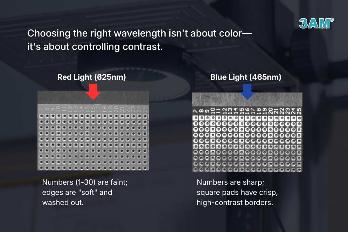 The solution: Blue light. When blue light hits copper, the material absorbs those wavelengths instead of reflecting them. On a monochrome sensor, the copper background appears dark, and surface defects, edges, and etched codes stand out in sharp, high-contrast detail. Same part. Different wavelength. Completely different result.
Why we always test, even when the theory is clear
Even with the color wheel as a guide, every application is unique.
A red plastic part from one manufacturer might have a glossy finish. The same red part from another manufacturer might be matte. They react differently to the same light, which is why we never recommend a solution without testing.
Our recommended approach:
Step 1 — Start with the rule.
Use the color wheel to identify 2 or 3 candidate wavelengths based on your part color and defect type.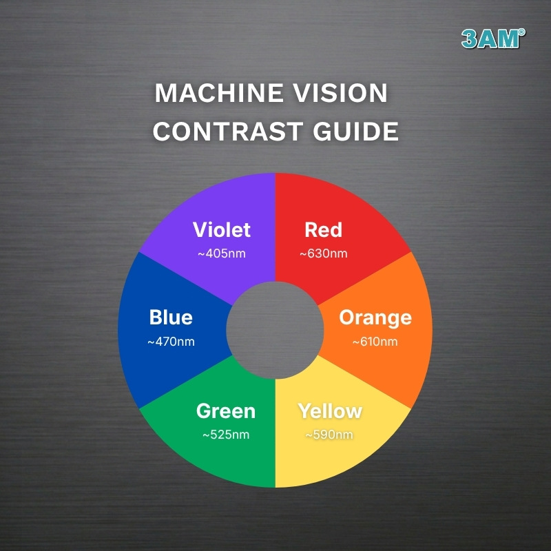 Step 2 — Test the angle.
Sometimes the problem isn't the color — it's the geometry. A bar light at 10° (darkfield) produces very different results than a ring light at 45° (brightfield) even under the same wavelength. Both variables matter.
Step 3 — Adjust the working distance.
Moving the light closer or further from the part changes intensity and light spread. Small adjustments can significantly affect contrast.
Step 4 — Validate.
Once you find the wavelength and setup that makes the defect sharpest and most consistent, you have your solution.
Key takeaway
There is no single best wavelength — performance depends on your material, surface finish, defect type, and camera setup. But with two simple rules and a basic understanding of how cameras see contrast, you can narrow the options quickly and test your way to the right answer. Wavelength is one half of the lighting decision. The other half is lighting geometry — the angle, direction, and type of light. That's a topic we'll cover in depth in the next article in this series.